
I really struggled to think how I could create my own cosmic image using the glitter sparkle. I had to think creatively of how I could get different effects to get the right look. I thought of printing out a cosmic image and putting glitter on it and rephotographing it but this didn't seem like it would work as much as I hoped and would still be using someone else's imagery. Photographing the glitter on black card is a start however getting the layers of different aspects to make it more cosmic will need other techniques.
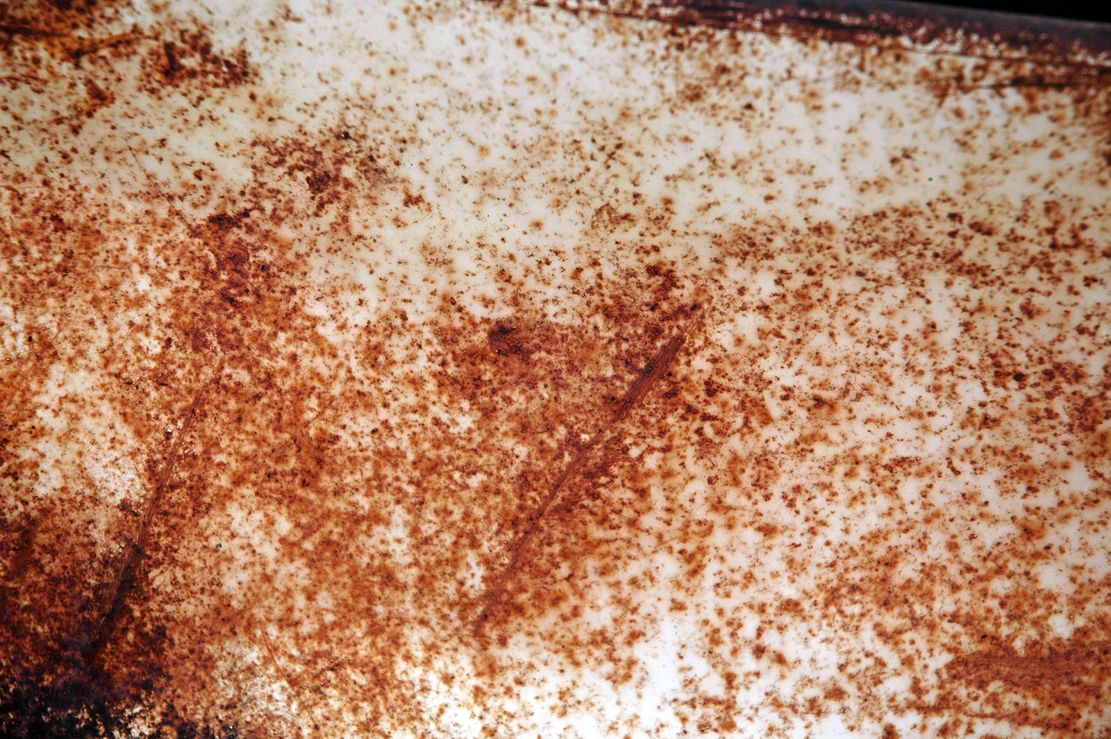

I took a picture of rust from google as I noticed from the cosmic photos there was this speckled copper behind the stars and smoke. I then took selected parts and layered over a black with a low opacity to see if I could get a similar effect. It's not quite right but its because it wouldn't be jet black in the middle, it needs light. I'm going to try overlapping it on a photograph i've taken instead.

I burnt black paper to see if it would have an effect. It came out really nice and gave a smokey appearance that was actually darker than the black paper.


I saw from this tutorial the brush effects could be used to create star light qualities so I tried out a few myself which could add a bit more cosmic feel to the imagery of glitter.
(http://videocreative.org/PSD/Cosmic/Index.html)
I tried rearranging the typeface I found to make it more legible but it proved difficult and didn't look like i'd hope. I think i'm going to try and use a more subtle and legible typeface for the bottles thats still strong and bold but is good for a bit of body copy for description.


No comments:
Post a Comment