Change of plan. I decided to scrap the Russian doll idea as it didn't have a strong concept and wasn't unique enough as a solution for the brief. It was more a personal approach than anything so I entered my design for ToDryFor competition instead so it still got some use!
My new idea came to me the day before the deadline after all this time of struggling to think of something I would be happy with it finally arrived.
The idea was to solve the problem of the competitive industry by not only just standing out amongst the crowd but being different to it. The idea to have a make your own message craft kit using wood block rubber stamps would attract an audience after quality and quantity with little time, resources and creativity who want to make an impression and show attention to there cards and recipients. This kit will allow them to easily make a personalised impact and get repeated enjoyment and use. To maintain purchasing of the brand and products it would be extended to many ranges of different typefaces, punctuation and numbers as well as decorative letters and images. This can also branch to other gift products such as wrapping paper, tags, ribbon etc. where the stamps can be used to create a united gift experience.
I tried a few san serif typefaces for a clean and honest branding.
For the logo I wanted to create a 'w' that resembled a woodchuck (land beavers) mouth and teeth shape.
These weren't creating the look and imagery I was after for I decided to try a more symmetrical and rounded approach.
These looked a lot more like the imagery I was going for and I chose to go with the logo with lower edges to enhance the image over the letter form. I went with the lowercase as it was more friendly and softer. I used greeting phrases to cover the tin to show the print of the stamps without having to use a photograph of the actual stamps.
I realised there needed to be information on the front so people knew what it was so this changed the size of the label.
I changed the description on the tin about the ink pads as I felt it was unbalanced and to long. The detailed information was on the back so it was still present.
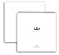
I had forgotten envelopes! I made the amount of cards smaller so there was 10 and 10 envelopes and that it was 2 thick to fit in the tin with the stamps. I also put the UK Greetings logo on the tin and back of the cards to spread awareness of the company's involvement in the range and as it was part of the brief to design the back of the card.


No comments:
Post a Comment