
I noted what the brief said they liked, the problem, what they want, the audience and the tone.
Liked: I like there packaging at the moment as its clear, colourful and impactful. It also makes there name clear which is good for a recently established brand in the market.
The problem: They were being to modest with the key health factors for there juice.
What they want: They wanted to showcase these factors on the packaging and maintain the morals and enthusiasm the brand identity holds.
The audience: 16 - 34, upbeat and bright side of life people, sociable, willing to spend money for good quality health juice
Tone of voice: Friendly, fun, cheeky
Sketches:

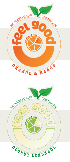
When I thought of good I thought of the symbol of a tick which I thought of curving a leaf into the shape of. After sketching and visual research I transformed the stem into a tick shape which is very subliminally placed in two leafs.


I wanted to create the round shape which symbolises the fruit used in the drink including the text and a smile for the 'feel good' factor. From sketching out ideas of creating teeth for faces I came up with this simple idea. It contains the typeface of the logo making up the top half and the bottom halve forming a smile shape. The idea was the these were a window through to the juice so the colour of the juice made up the label emphasising the fruit essence of it.
They said they wanted to include the good points of the juice so I tried to incorporate one in the middle of the circle but struggled.


It wasn't working for me so I tried elsewhere in the smile for the space. I tried a friendly hand written typeface and an honest, trustworthy sans serif typeface.


I tried adding in some imagery to make it more friendly and emphasise the fruit ingredients.


The 5 a day wasn't working for me, I didn't like how it interrupted the smile window space. I came up with the idea of combining the information with imagery and using segments represent that its one your 5 a day. I tried the two different typefaces again for this new idea and decided to go for the sans serif as it looked a lot cleaner and simple which is the style atheistic the clients like.


I decided to make the pie piece a window to as it displayed the juice which enforces the idea that the juice make up one of your five a day.

Know happy with this design I transformed this across to the other flavours. However I was faced with difficulty when doing the cloudy lemonade as the colour behind was light as was the label so the windows blended to much. I didn't want to change the label background as it would separate from the rest of range so I used an outline to make it stand out.


I liked the definition of the circle so applied the same to the orange and mango. I was undecided between the line or not. I decided to place it over a colour background to represent the liquid.


This is when I realised I had a problem in my design. The dark writing was completely different when placed on colour liquid. It was illegible and looked garish. To fix this I tried making it the label colour which did make it readable HOWEVER it took away the hierarchy that I was using with the use of colour and type. To solve this I moved it into the label so it didn't blend in the label packaging by being the same colour. I also change the logo typeface and name into a strong dark colour so it stands out as when used as a window it blended to much with the bottle and didn't stand out as the logo/company.


This concentrated the smile and segment and the purpose of them showing the juice. The smile is made from the juice and juice segment is your 5 a day.
I had grown fond of the gradient so I tried that for the logo but reversed back to the solid colour as it was visually stronger.


I spread this new design and layout across the different flavours.

The brief stated they wanted the still and sparkling labels reworked. I started applying the label to the sparkling range.
After visual research of fruit segments in sparkling water I decided to apply bubbles to my segment diagram. This was to minor of a detail so I applied it to the smile to and tried it by itself. It seemed to neat for sparkling water which is supposed to be fizzy and free like the bubbles.


I put the bubbles on the outside and this suited the design better. I tried adding the word fizzy with the bubble atheistic with the logo typeface, this evidently didn't work and it needed to stay simple and clean like the rest of the design. I tried various ways of adding it and I really found it difficult to make it fit and work. In the end I added it to the fruit flavour with the clean sans serif, this makes the word stand out from the flavour and works within the design.


I am happy with my design at this point as it was created all under such a small amount of time and it forced me to work on it at a constant pace instead of a pick it up, put it down approach where I would go back and rework and add to it at another point. I feel that my design is conscious and answers the brief well whilst keeping the atheistic they favour and morals of the brand. The green really stands out on all the different flavours and really brings home the health and freshness of the juice.
This brief was to be a quick and turnaround brief because of the approaching deadline and I continued to do it with the lack of time as I thought it would be interesting to see if I could balance it with other and complete to a happy standard in time and also due to the potential I saw in it for design as packaging is a favourite as mine. What i've learnt from doing this brief is that in order to complete a brief in a quick time I need to not only sketch out my ideas to involve and the imagery I want to use and imitate but the whole label shape, layout of information, colour and to consider this once applied to the container. If I had done this before I had digitally started that I would of known where and what I was including and it would of been a simple task and put everything in place.
No comments:
Post a Comment