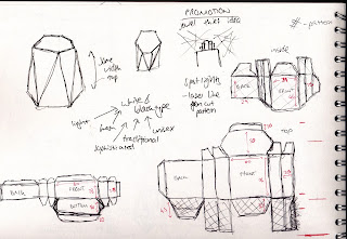
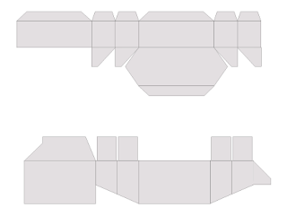
After are decisions on the packaging I looked at making a net. I originally did the first net the full dimensions instead of splitting it for the lid and the bottom so I had to redo it. Using the golden ratio I work out the ratio for the height so I would get an atheistically pleasing proportion split.
The idea of this net that I created was so there was no joins at the top so it would look clean and neat. However after doing this I realised it wasn't good having the side join as it it meant edges stuck out more and the net wasn't a very economic design as it wasted paper. I also felt the proportion wasn't as I had hoped, the bottom was to big and it was meant to be a stand for the bottle and the lid take up the majority.
I looked at the box where which had the same idea of fastening. From this I worked out what tabs where need and what sides attached. Then I applied to my measurements keeping my original golden ratio and repeating the same on the bottom section to get the golden ratio of the inside part and bottom part. Before creating, printing and folding them and then realising the ratio wasn't correct I drew out marks to see if it looked right (the red dashes).
From trying this net I realised that the hexagon lid didn't fit the sides properly and that the tabs to over lie inside and make the edge thicker needed to be a bit thinner to stick better. I also realised that in order for the inside net to fit then the weight of the stock needn't to be took into consideration.
New net:
I created a digital mock up so it showed how the packaging look closed and shut. This gives us a practical and digital version to show how it would look.


No comments:
Post a Comment