
.png/170px-Chrysler_Building_spire,_Manhattan,_by_Carol_Highsmith_(LOC_highsm.04444).png)
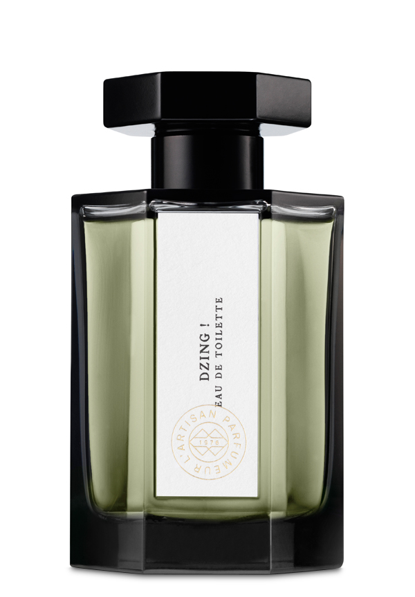
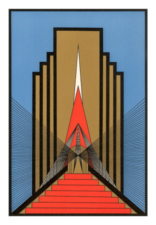
The hexagonal shape gives a similar appearance to the descending rectangles and use of geometric shapes. Each bottle also features a small little illustration. The typeface they also uses seems quite art deco to me with slight difference in weight stroke through the letters and the use of capitals. I really like the look they have and it does appear very vintage Paris French whilst still looking quite modern.
The research into unisex brands was also very interesting. They all had quite similar techniques in maintaining the equality of the sexes like a minimal colour scheme to white and black and others gold, simple bottle shapes that were androgynous, and sans serif typefaces to represent the contemporary aspects of a scent being for both sexes. The D&G range of unisex scents has 8 scents in total but advertised with a model connected to 6, 3 males and 3 females. They are based on tarot cards and try and portray the personality of the card. Although they are a unisex range, it is actually split to 4 female scents and 4 male scents however both are wearable for either sex. With a range I think this is quite a good idea as men and women would tend to go towards certain ones within a range rather than when they have the choice of just one scent and they like it or not. A range creates choice and the elements of the scent or personality of it will determine the choice of the consumer. If one has a more masculine colour choice or packaging or shaped bottle it may be more inclined to smell it first. Unless the range is kept completely androgynous across all the scents, packaging, colour choices and names then only will the scent determine the gender of the buyer.

I had actually brainstormed some ideas about what route our concept could take and personalities was one of them as the description of the scents were characteristics either that be of a person or a moment. I then thought they could be named by peoples names which represent those characteristics. I also thought of a route of emotions and the feelings attached to the descriptions and how they are like a moment in time connected to senses. This made me think of gems and precious, perfect productions. The geometric and tessellating opportunities in this could be interesting in the design of the perfume bottles and packaging as well as be an interesting concept.
In reference to the unisex side of the concept I noted that unisex is a contemporary and modern idea in the perfume industry and that the design must reflect that. Also from my research I took notice that our initial visual of bottles all being different may not be ideal and would attract a more feminine audience as unisex and male fragrances are simple and minimal and they are the harder audience to attract as they not as open to unisex fragrances as females are. Because of this I listed names, lids, packaging and colour scheme as ways of possibly differentiating the different scents rather than the shape of the bottle.
No comments:
Post a Comment