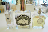
A L'Artisan Parfumeur bottle formed from a hexagon. The brand is engraved in the glass on the side of the bottle and the pattern on the top of the lid.
Other leading up market brands of perfume all using clear glass bottles and metallic lid or nozzles. They also use a label to hold the information of the perfume eg name. We were going to just have the type printed on the bottle but maybe a label should be considered more as it is popular for a reason, legibility.
Competition: This brand has been going since the 1930's and has the same art deco atheistic, this is a brand that is competition for L'Artisan Parfumeur.
I was interesting in this packaging it used a very bold colour and gold foiling but didn't look tacky. It has a strong look with it's vibrant colour. I think that this lid closure would be more appropriate for our net than a tab lid. I also really like the frosty glass, I hadn't considered this as an option and it may not be appropriate for our gem theme but it is a strong atheistic to the bottle.
Looking at up market male products. This brand contains a lot more information on the front of there products.
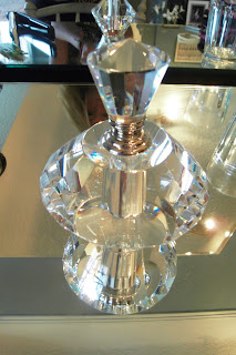
I looked at some glass perfume bottles that had art deco shape and features. I liked how the glass reflected in the mirror and bounced the light around. This has inspired me for the point of sale and promotion. They could be displayed on mirror surfaces to showcase it's shape and use of material as well as pushing the concept. I feel it will also attract the audience as it will shine from the rest of L'Artisan Parfumeur products and produce an idea to the audience who have the right mindset.
I like the stopper lid in this perfume using a shape to plug the hole instead of nozzle. We could look at this as an option instead of a spray nozzle as the audience they are aiming at are experienced in perfume and this is more professional and traditional application of the product.


No comments:
Post a Comment