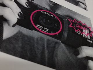
I printed some of the promotional pieces I had designed using the digital printers downstairs on a matt stock that was heavier weight than paper but not card to give it a firmness to stop them being flimsy. I printed both ones with pink as back up and ones without to screen print on. I'm going to laminate the contact cards and the leaflets on the one side so they look like photographs and also to give the cards more durability as there interactive with the die cut viewfinder.
Photo holder for the complimentary photo at the end of the exhibit
Contact cards before lamination
I was happy with the pt size of the text when printed also
Tickets as polaroids - unfortunately the double sided was a bit off which is frustrating but i'm going to but clear vinyl over the front photo so it looks and feels more like a polaroid picture.
Staff passes
Leaflets before lamination - I think the dated photo effects worked well when printed
I was really pleased with the reverse side and I feel it really takes on the atheistic of the back of a photo, the grey printed just right!


No comments:
Post a Comment