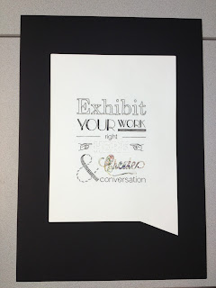
To enhance the idea of conversation I cut out a speech bubble in the mount board so that it was incorporated in the design rather than just having it frame the poster.
I put coloured loose thread behind the word create as the only colour in the poster to represent the creativity of the exhibit and obviously the word meaning.
I was really pleased with the end result of my poster and felt the hours paid off in the final piece. I was also happy with my voting average of 16.86 and getting my poster into the frames! I think that the hand craft is what made it stand out and would offer something different to the frames encouraging creative ways to fill the frame than just print. In the crit people said that the word create cut out added a texture to the poster.


No comments:
Post a Comment