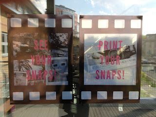
I took pictures of the posters on windows so you could see how the transparency of the posters would work in seeing through into the space. Unfortunately theres a lot of reflection so it's difficult to see in.
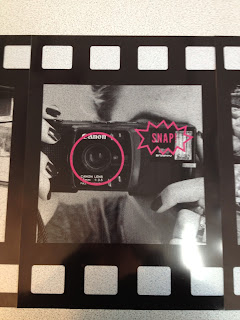
These are images of the pictures in the order they would appear and it also shows how the film roll flows to look like a long strip of film.
This is the promotional poster that would appear in various other locations like public transport, local social locations like places to eat and shopping centres etc windows so what appears out the window acts as subject of the lens. As shown below:
This then makes the promotional poster interactive like the actual exhibition and also encourages participation through the fun aspect (like the seaside body cuts of placing your face in the image).


No comments:
Post a Comment