
I took some photos of me holding an analogue camera and pretending to use it as imagery for my promotional material.


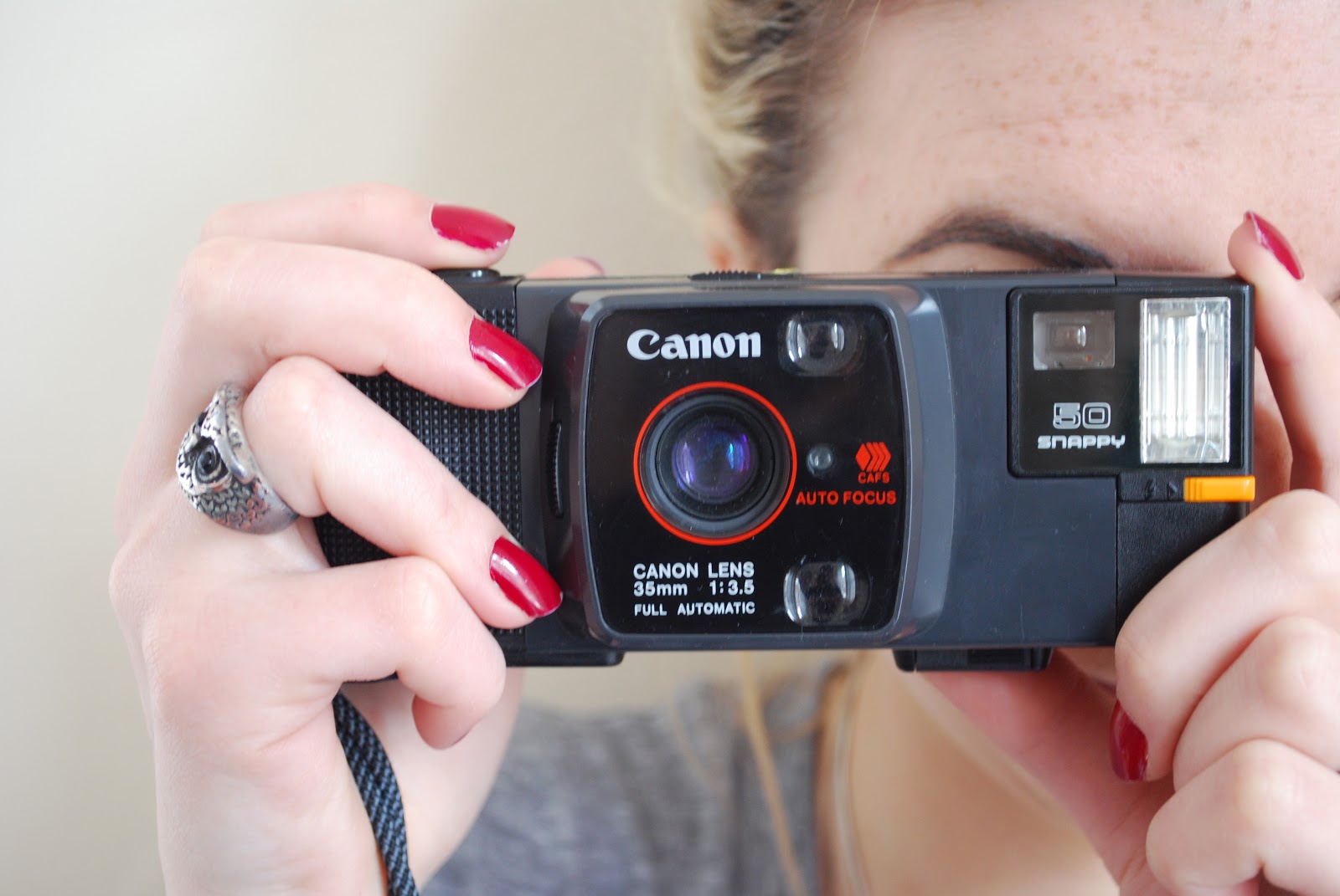

I then made the colour black and white so that the bright pink would stand out on top of the image and boosted different levels to get a more aged look which wasn't just black and white .


I went with the close up of the camera as I wanted the focus to be on the hands and camera rather the person.


I looked at old photo processing formats and the atheistic used on the photo holder to inspire the formats of my exhibition promotional material. I also was reminded of the light print on the back of the photo paper.
Leaflet:
For the leaflet I took influence from a processed photograph for the format and atheistic of the design. The front is a photograph of an analogue camera being used to demonstrate the purpose and process of the actual event. It also works with the logo of the exhibition and puts the drawn back imagery in context so it makes it clear. This would hopefully have a finish of a photograph possibly a matt photo or glossy however matt might be more possibly due to it needing to be double sided. It is also the dimensions of a photo print (6 by 4).


For the back of the leaflet I wanted to imitate the back of a photograph with the logo at an angle with a really light grey. I then chose the binary text and similar symbols like > for the copy explaining the event like the text on the back that codes the processing print of the photo.


Other than standard photographs I looked at the format of the polaroid as that was going to be one of the cameras and is a very notorious format and atheistic well known to those who aren't into photography and aren't from the generation it was very poplar.
Ticket:
The ticket took the atheistic of my polaroid research using the size of the actual photo and holder. I took the features from the leaflet, the type faces and imagery, and applied them to the tickets to create continuity across the formats. I added the hand written text to imitate the way people use polaroids and scribble the date or name of the photo. The square image is perforated along the outside so that when the people arrive the ticket can be snapped apart and they keep the info and the exhibit can store the important information.


Contact card:
For the contact card I took the dimensions of a business card rather than photography format as it needs to be something to store in a wallet or pocket. To make it a bit more interesting I added the button at the top like that of a analog camera. I wanted to keep the information very minimal due to the space but provide enough to maybe encourage people to find out more.

To add to the interactiveness of the card I added a die cut section that would act as a viewfinder. This makes the card more interactive and something to engage the audience with engaging with the promotional material and hopefully the actual exhibition.

I centered the information as it didn't look proportioned when in line with the viewfinder.

For the front I originally was going to just have the logo but when I actually did this digitally I wasn't very pleased with how it looked. I therefore tried different dimensions.


When I decided I was going to have the die cut viewfinder then I tried it with that space missing and just couldn't make it work very well.

Therefore I tired with photography imagery. I think when printed this will give a better visual than the plan white and logo.

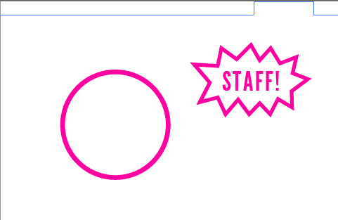
Staff Pass:
This would be the card that would hang around the necks of the people involved in running the exhibit and helping those who are participating. I wanted the staff pass to be using the same design thats throughout therefore I changed the word snap to staff and used the camera outline of the contact card.
I looked back at the photography I had used and thought it looked very clear and crisp so I then tried editing it to create a film grain so it looks more dated than digital. This would be more like analogue photography results than a digital.


I didn't feel that this was evident enough so decided to research and find out techniques in making photos dated. I used the tutorial below to create the dated image. The techniques worked well but I didn't want the sepia tone as I was printed pink over the top.
(http://www.photoshopessentials.com/photo-effects/old-photo/)

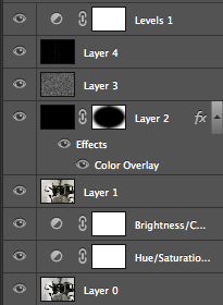
The different parts to the photo
I tried it with the pink but I don't think it worked very well so I decided to use some of the techniques on my original photo instead.


I also tried a pure black and white

After getting a bit of feedback of peers I decided to go with my original photo but with the new added techniques
Applying this to other products.


Applying this to other products.


I think it looks a lot better and more appropriate to the exhibitions
No comments:
Post a Comment