I created a mock up of my photo pouch as I had created the net myself using my primary research. I need to see if it folded correctly and that the text and images worked effectively as the atheistic the pouches normally have.
I feel that it defiantly folded and carried characteristics of those I had in my primary research so I decided to go ahead and print it properly.
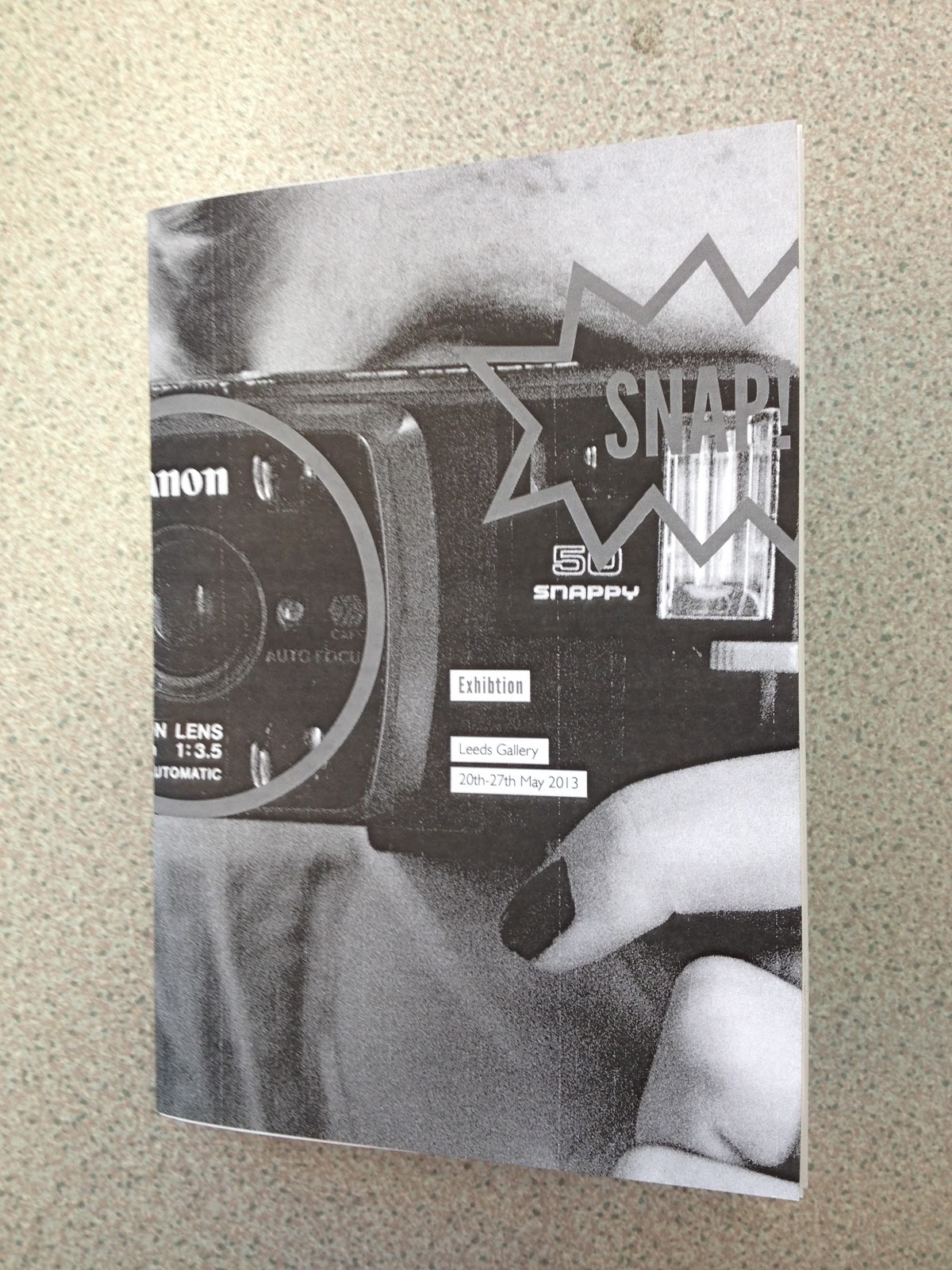
I also did a practice run of my publication as i've had problems in the past with the layout of my publication in indesign and printing on different stocks. I had to check when it paginated that nothing was on the reverse of the tracing paper. Also to check the pt of my copy as the format was small I didn't want the text to look massive and dominate the layout but I did want it to be legible.
I feel the pt size was fine as if it was smaller it might be to small and it wasn't so large that it dominate the layout. The pages also printed correctly once paginated so I was pleased although for some reason it didn't print the middle spread.


No comments:
Post a Comment