
I decided to experiment with the hand drawn illustration after finding those images in my research. I used a graphic tablet for the first time which was fun but more difficult than I had expected. I wanted the flow of hand movement in drawing rather than tracing over an image with the pen tool.


These were my first two attempts were and this was when I realised it might be a bit unrealistic to get my images like those I had found. However I started tweaking the lines a bit and ended up with this wobbly but illustrated image that I was quite pleased with. I tried various line strokes and brushes to see if I could make the line look more hand drawn but in the end I found that I preferred the standard line the most.


I then tried the illustration with the logo which looked quite good as the thickness of the logo really stood out on the dainty lines.
As the images I had drawn inspiration from had been filled with colour I thought I would attempt this also to see if I would prefer that. I was pretty pleased with the result and like the whole messy filled in look. This however wasn't appropriate to use on the poster as the atheistic of the design was so far from the other pieces of promotional material. I thought it could be used instead of the photograph of the camera in the publication.

I think this looks really fitting with the bright pink as the colour kind of suggests animated and the hand drawn suggests an analog approach to image.
 |
| rough |
 |
| neat |
I then did the outlines of the other cameras using photographs I sourced in research for content.


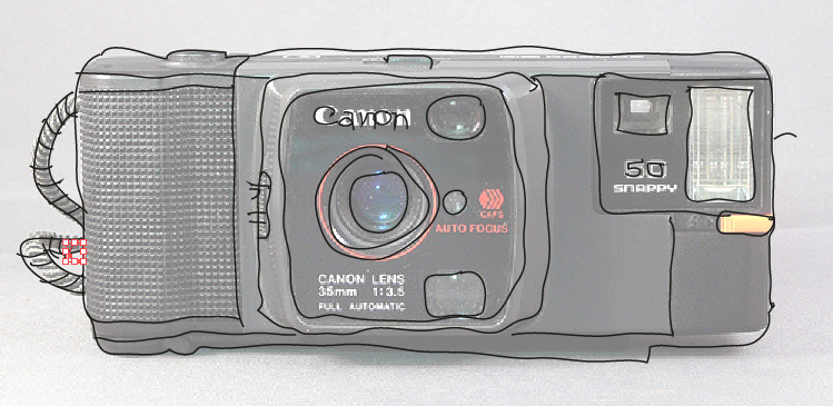

I really like the outline over the top of the photograph which is what I had originally planned for the publication with the use of tracing paper.
No comments:
Post a Comment