


I prefer them within the outside fill and i think for my idea the three arrow symbol is most appropriate as thats the symbol for reduce, reuse and recycle.
I experimented making my own which i'd used in my design idea drawings


but i think the original symbol works best and would communicate better as its already so well known
Creating it in a grid to keep all the stamps aligned and size correct


from scale its not as clear as i hoped so i played with scale


This is the scale i think i'm going to go for and i'm going to keep it all in capitals to keep it clear and ledgible

Final grid layout

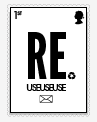

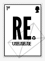


I felt the remember one needed a visual along with it as all the others so which led to me putting in the bin icon in the bottom right corner

once i'd done this i realised this could be the place for the envelope also and would be more seeable

i made a bike frame out of cans using the clipping mask tool


the stamp might be so small scale you can't see so i thought of making an alternative


Adding colour


I decided to make the recycle logo/full-stop the same colour on them all to create consistency and also create a hierarchy towards the symbol
I used the swatch under nature called landscape as the stamps are to promote actions towards a healthier environment


No comments:
Post a Comment