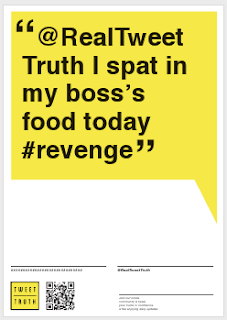
Today we were all in sessions at different times which didn't make things easy but everyone was designing and collaborating at different points. We all came together properly with our final designs for print tomorrow:
Stes Posters
Sebs Posters
Nigel Posters
Abbas Posters
From this you can see although theres the same layout for the designs there are to many visuals that are way to confusing. The layout looked amazing and professional which we really liked but we realised it wasn't going to work together as there was just to much. In order for this to work it needed to be simple and spread across the different formats.
We did begin to worry as we were running out of time and had kept switching and swapping between different visuals due to different tastes and ideas which confused matters more. With us all together we decided this was the time to sort it and get it figured out together.
The poster layout looked very professional (suitable to our market) and visually attractive. Abbas idea of tweets in a yellow box also fitted well as it was what our concept is and would catch the eye of the audience due it's nature of being something you don't say or see in public - shock factor. I suggested that we bring the ideas together and have the layout of the poster down the bottom with the yellow box of the tweet above instead of the visuals they had been using.
We began to draw out how we could brand this across the the different formats using the idea of big bold tweets and it worked. As a group we discussed what should be on the stickers, business cards and flyers to make sure they contained the right and enough information and limited down from all the visuals we'd originally had that were no longer needed.
Seb said we should add a bit to the the rectangle of the text to make it a speech box. We all agreed this worked.
As a team we sat and designed together. First with the posters which had the layout made by Ste and sourced suitable twits related to the target audience which had originated from Abbas.
From this we then made the flyers using the same information just altering the layout and making it suitable size.
Then it was the business card. We struggled with this and played around with having the logo and/or QR in the speech box and information underneath. It didn't seem to fit as the logo was white and black and seemed amateur within the yellow box. However then we tried having all the information from the bottom on the poster within it and it fitted perfectly especially with the lines lining up with the edge of speech box. The logo fitted better being yellow and black in the business card. We then went back and changed it on the posters and flyers which also suited better as it then stood out along the information which was in a large space of white.
We were extremely happy with the result and felt it fitted our target audience as well as having a solid identity that could be spread easily.


No comments:
Post a Comment