Indesign
- You choose your document size based on what your finished printed, trimmed product will be.
- Margins and columns will give you guides if you have a specific layout
- Give you a consistent layout
More options:
- Bleed - If you have anything going to the edge of the page then add a bleed to extend off the page a certain amount to help when trimming
- Discuss bleed with printer as well stock and colour reference system
- 3mm is the general value
- Slug - area outside of printed page, used for printer marks etc.
- When making a book you want facing pages clicked

- Digital Publishing is for things such as ipad or app technology
- Blue is the slug
- Red is the bleed
- Black is the page edge
- Pink/purple is the margin
Colour
- To apply colour you just have a frame whether thats for text, image or just colour
- Same as illustrator in creating colours
- The grey shaded box shows its a global colour
- The box with a spot shows its a spot colour
- When you click on the T image you can alter the colour of the text by clicking on the different swatches
- The box image is for the fill of the text box
Creating a tint swatch
- Shows the percentage of the tint
Preparing your image
Photoshop
- Should be CMYK or greyscale
- Resolution should be 300dpi
- Actual size once in document otherwise causes difficulties when printing
- PSD or TIFF file format (PSD over tiff if you have layers as you can edit or work with transparency)
Illustrator
- .Ai file format
- Can copy and paste across into indesign
- CMYK mode or spot colours
- Can change size in indesign as its vector based and won't effect quality
Psd image
- Image spot colours go directly to the swatch palette
- Image quality is still the same but not represented on indesign document so it can work faster
Greyscale Image
- Click on the picture grabber (the circles)
- The box will go brown and then select a colour swatch
- To edit the image you can right click the image and 'edit with' and choose what software to open with or 'edit original' and go straight to Photoshop
Make image transparent
- Open image in photoshop
- Double click background layer to change to a normal layer
- Click ok
- Use the magic wand to select the area for transparency
- Delete selection
- Save as a PSD file
- Make sure the layers option is selected
- You can change the background fill colour now as the image is transparent but can not change the colour of the image, that is only with a greyscale tiff
Print separations
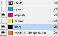
- Palette is like the swatch palette, thats why its important to add our spot colours to palette
- Change the menu to separations
- Click the different colours into view to see the separation of colours
CYAN
MAGENTA
YELLOW
KEY (black)
Spot colour
All colours in view
Selection in view
- Delete any colours not being used to prevent any empty positives being used and save on cost
Printing the separations
- Click on output section of menu
- Default is 'composite grey'
- Change to 'separations'
- Shows in inks all the different separations it will print
- The frequency is the number of half tone dots in every inch - the larger the frequency the closer/smaller the dots will be
- The angle is when printing in CMYK - the grids of half tones are angled to overlay the colours and prevent interference patterns
Overprint separations
- Colours knock out each other so they don't overlay and create another colour
- If you want them to overlay and mix on the stock or use spot colours and varnishes then go to 'output' and 'attributes'
- Click the overprint fill option
- The colours not overlay on top of one another and mixing to make a new colour
- When you choose the ink limit it shows you in greyscale the overlaying of inks
- The red warns you that it might be to much ink and could cause damage or tearing to your print


No comments:
Post a Comment