Tuesday, 30 October 2012

Design Production: Stock

Different samples of stock:

 Gloss side of black
Colour edging
 Black on newsprint
Matt side of black
You can see the texture of the stock - possible laid
Pulp embossing
Silver ink on black comes out really nicely

metallic and matt combination
The texture of the card ink is embossed in
samples books of available stocks and weights
A sample swatch book of all the stocks a certain printer uses
I liked the intensity of colour in the gloss paper and the matt shine finish of the red
really textured paper
transluent print paper
paper resembling 3d surface textures
you can see the handmade texture in the paper and how it can be used with different colours
colour swatch book with textures
demonstration of language and information of paper
My collection of stock:
Seeing and feeling different stock showed the breadth thats available and how colour prints differently. You can see particularly with the black with gloss and no gloss how it alters the colour and appearance massively.

Design Production: Design for Web Workshop

As a group we discussed what websites are used for -
  • Showing information
  • Contact details
  • Promotion 
  • Informing 
  • Persuasion 
  • Entertainment - this could be used as a way of communicating the above

An important point that Lorraine mentioned in this workshop was that the audience is never EVERYONE, there will always be a targeted audience wether that be a large or small audience.

3 important factors a website must have:

  • Usability - is it easy to use
  • Aesthetics - is it visually appealing
  • Functional - does it fulfil its purpose


We had to list the different pages we would have on a website promoting ourselves as a designer and what information they would hold.


Once we had done that we then debated on what pages we should and shouldn't and could have on our website. 
Other page ideas:
Landing Page - we discussed in detail if this was necessary and it was said that it was a barrier between the user seeing the information/work and they only give a website 5 seconds before deciding wether to browse further
Blog - current projects your working on / document professional development / collaborations - who you are working with
FAQ - frequently asked questions by people eg. Do you work experience? etc.
Quotes - if you sell pieces of work eg. screenprints then you can give an average cost for size of prints and colours however if you don't sell prints etc. then don't have a quotes page as your costing will vary from client to client
Shop - again if you sell products then you can have a page where they can purchase from
Clients - for an established designer this might be appropriate but at the moment it wouldn't as it you wouldn't have a large client base and wouldn't look very good

We then had to sketch a layout for our homepage considering what pages would feature in the navigation after the discussion we had.


  • Sans serf font
  • Title of project would link to project in detail
  • Pencil arrows appear by hovering over
Feedback -

Person 1:
- if work is on home page, why have a 'work' tab?
- clear design with large images makes a good looking homepage - will look impressive on a big screen
- will the projects automatically switch if the user doesn't find the arrow icon?

Response:
The work displayed on the homepage would only be a small sample of work, current projects or event updates. They would switch automatically but there is also an order list below which shows that there are more pages to see even if they don't find the arrows.

Person 2:
- good idea and good illustration
- this isn't a homepage though, wheres your name etc? I'm confused to the '!' Is that your logo?

Response:
The '!' was my logo but in reflection I should of put my name as a designer or studio with the logo to make it more clear

Person 3:
- like that you can flick through project on homepage
- layout is clear
- navigation works well across top of website
- sans serif font suits modern layout

Response:
Thanks!

Person 4:
- well balanced
- logo between links looks good and works well
- easy to look at and clean and simple
- work is clear straight away

Response:
Thanks!

Person 5:
- the work is the first thing you see
- good clarity and room for description
- easy navigation
- mysterious.. who are you? No name or identity

Response:
Again this person didn't realise that it was the logo in the middle but I was happy with the rest of the feedback I got

Person 6:
- no visible name, who is it?
- good simple layout
- a little too minimal, could do with more info about who you are
- what is project x?
- consistency of logo is  good

Response:
Project X was just a gesture of where the title of the project would go in the information section of the slideshow. Again the mention that they didn't no who I was suggest I should of put some information on who I was and a name as well as a logo. The consistency of the logo wasn't what I was suggesting when putting it on the box it was just to represent that the image was of a design I had done.

Overall:
I was pleased with the majority of my feedback as they had aspects of usability, good atheistic and functionality which are vital in making a good website design. The logo I quickly made was supposed to be an upside down 'i' which is obviously the initial of my name as well as the punctuation symbol, explanation mark. This didn't read well with some of the people critics as they didn't no who I was and didn't make the connection so in reflection I should of put my name as well as the logo.

Thursday, 25 October 2012

Design Production: Type Workshop - 2

After looking around the groups A4 characteristics of different typefaces I realised that I could of gone into a lot of detail and not stuck to 3 key characteristics he asked for.


We then had to think of 3 words that we felt described the personality of the typeface
From this we had to choose a brand or product that fitted the personality of the typeface
And then one that did not fit the personality

 KERNING
  • Kern one word, not a whole sentence
  • Only do positive kerning
  • The biggest space is the right amount of spacing so you should positive kern the rest of the letters from that 
  • Even amount of space between each
  • Makes it appear trustworthy, balanced, professional


We kerned our first names as fonts on the computer aren't kerned properly. 


HIERARCHY
  • Theres a difference between looking and reading
We had to arrange one to three backwards in order but make the reader still read it in its correct sequence

I gave one a thicker weight and enlarged its pt size to draw the focus of the eye then descaled the pt size gradually for the following numbers

We then had to do it without altering weight, pt size or case

I did it in a tiered effect from left to right as thats how we culturally are trained

To push this further I then altered the stroke to Italic

Another way I altered the text to get the eye to read in sequence was to rotate the text so the eye goes to what is more familiar

We then went through some interesting ideas of hierarchy about how looking and reading are different things. Initially are eyes are drawn to the middle of the page but then it goes to the top to start reading. If this is altered from what we find 'normal' then the eye goes down to look for familiarity. 

We then had to arrange the numbers in the order one, three, four, two from bottom to top but get it to read in the correct sequence.


WebRep
currentVote
noRating
noWeight

Wednesday, 24 October 2012

Design Production: Design for Web - 1

5 seconds someone will give on a website to decide wether to go on it or not

Exercise 1:
Shout what comes to your head you see the website homepage

www.ollymoss.com

  • black
  • dark
  • dull
  • space
  • empty
  • i like it
Made in Indexhibit
Disadvantage - everyones site looks the same only unique thing is the content

Mistake designers make - the design shouldn't be what makes it look good it should be the content 


www.malikafavre.com
  • lipstick
  • slow
  • fun
  • bright
  • gifs
Made in Cargo

Different to Indexhibit : Content is immediately there


http://360langstrasse.sf.tv/page/
  • Photo
  • German
  • Google street

(struggled to react with it)


www.mercertavern.com
  • boxes
  • neat
  • hipster
  • clean
  • nice
  • retro
  • vintage
  • monotone

www.noble-design.co.uk
  • bright
  • colourful
  • neat


www.caavadesign.com
  • circle
  • space
  • photoshop
  • image
  • CD
The questions you must ask yourself:

What is the purpose of this website?
Who is the target audience?
What do the target audience need?

Online portfolio

Should be aimed at your clients not at you and what you like
Find out what they want to see : 
  • go on there website
  • see what work they do
  • ask them
Common aspects in a website:
  • type 
  • image
  • title
  • heading
  • vector images
  • navigation
4 main limitations:

  • the font - commonly known as standard fonts
    • if you use fonts off the computer for money making use you have to pay to use specific fonts 
    • uses fonts that the user has on there computer
    • use a font family to replace fonts if they don't have it
    • web kit - install a font on a website - have to pay a licence fee
  • colour - RBG colour mode
    • variant of RGB - web safe colours
    • hexadecimal code for a colour
  • the size - width and height
    • different size screens
    • standard web sizes to work with
  • resolution - dpi
    • screen based images - 72dpi - because there are on any screen only 72 pixels in every inch
    • not any more - 96dpi modern
    • retina display  - 227dpi
Language of design

HTML - hyer text markup language
URL - uniform resource locator
CSS - cascading style sheets
FTP - file transfer protocol
CMS - content management system/solution (allows them to update it)
WYSIWYG - what you see is what you get

WebRep
currentVote
noRating
noWeight

Design Production: Design for Web - 3 questions


http://www.gentlemensboutique.com/catalog/shoes
What is the purpose of this website?
To sell shoe, bags and accessory products and promote the business online
Who is the target audience?
Males interested in exclusive and well made fashion 
What do the target audience need?
Need to be able to view the range of products and purchase


http://madebytemple.com/
What is the purpose of this website?
Promote a design company
Who is the target audience?
Clients, people looking interested in design
What do the target audience need?
To see a varied display of there work, details of where/how to contact, background history about the company


http://smart-heart.ru/en/projects/way
http://worldaroundyou.org

What is the purpose of this website?
Charitable project encouraging people to be aware about the environment and world around them and to act upon it
I am bit confused the the purpose of this website due to the fact its bilingual but with no option to change the language to english
Who is the target audience?
People interested in looking after the environment, people who need to be made of aware of the problems in the environment
What do the target audience need?
Information in whats going on in the world that we need to be aware of, how to act upon it successfully, how to contact the charity, the charities intentions, the people within the charity, charity history


http://www.madebytait.com
What is the purpose of this website?
To sell the produce of Tait and promote the business 
Who is the target audience?
Homeowners, people who appreciated modern design of inside and outdoor furniture, possible clients to collaborate with
What do the target audience need?
A display of the products, details such as size, material, colour and price (I couldn't find price), what the company is and who they are, the latest things that the company are working on, how to contact to them


http://smart-heart.ru/
What is the purpose of this website?
Promote a design company
Who is the target audience?
Clients, people interested in design, other creatives wanting to collaborate with
What do the target audience need?
A display of the companies morals/history, previews of there work, ways to contact them

Tuesday, 23 October 2012

Design Production: 7 knows things about Printing

Based on lithographic printing

Colour Models -

  • CMYK
  • RGB
  • Hexochrome
  • Spot Colour
  • PMS - pantone matching system
Formats -
  • Standard ISO paper sizes
  • A & SRA sizes
  • Imperial (North America) verus Metric (rest of world)
    • good for standard size but with off cut
  • Tabloid (compact), Broadsheet, Berliner
  • Envelope 'C' series
Stock -
  • weights (gsm)
  • Finish - gloss/silk/matt/coated/uncoated
  • Laid or wove
  • Boards, cartons
  • Plastic & acetates
  • many more..
Artwork -
  • Document set up
  • File format and fonts
  • Spellcheck
  • Colour specification
  • Printer marks
  • Pre-flight check
  • Mock ups
  • Proof
  • Sign off (really important)
Print Process - 
  • Lithographic
  • Gravure
  • Screen print
  • Flexography
  • Pad printing
  • Six colour
  • Laminate - gloss/matt
  • Foil blocking
  • Embossing/de-bossing
Finishing -
  • Binding (what type?)
  • Folding & creasing
  • Die stamping/drilling
    • die stamping - inside cut out
    • die cutting - outside cut out
Costs -
  • Get a quote early on before you start the job if possible
  • Identical specification for 3 print estimators to work to
  • Learn roughly what things cost (unit cost)
  • Understand viable minimum quanities
  • Extras/Authors corrections
  • Delivery? - is it part of cost

Design Production: Design for Print - 5

INDESIGN

-Saddle stitch binding
-Perfect bound

Pages have got to be a multiple of 4 in order to bind properly with a front and back cover


TIP for knowing what the page number print will be in order as a book
Start on the left hand side as your front cover is on the right side of the page and then zig zag down until the half way point of the number of pages your book is formed of. Then zigzag back up so you end up on the left hand side where your back cover will be. This shows what pages will print out next to each on the same sheet.
Example with 8 page booklet:
L | R

8 | 1
2 | 7
6 | 3
4 | 5


  • A - has one master page - anything on it will be on all pages
  • A template for that document
  • Use it to add content to appear on every single page that is based on that master page
  • Double click on master page


  • Put whatever on the master page and it appears on all pages linked to it


  • Good for putting text boxes, graphic boxes etc
  • Can have consistency across the pages
CMD & SHIFT - unlock the frame so you can alter it on specific page


New master page


(no. of pages is 2 because its a facing page)

  • Can right click to apply or click and drag from the B-master to the page


Non master 


  • Drag to a page to make it a non master page

Numbering
  • Click on the master page
  • Create an empty text box
  •  This changes it to 'A'

  •  Format the number how you want it to be displayed on the pages

  •  This then numbers the pages automatically on all the pages with the master page applied

  • Alter what page it starts on and what number it starts at:


Printing

  •  Can choose how you bind

  •  Print settings option:

  • Can tell your on booklet mode because theres not print preview
  • Setup > Paper size bigger than your document size to allow a bleed and trim marks > Landscape so the A4 is portrait > Centred so when printing double sided it aligns up for trimming
  • General > Print Blank pages selected because your inside cover will usually be blank etc

  •  Printer > Change two-sided to long-edge binding

  • Can check preview - it will show any errors in the warning box before you print
  • When printing a mass of pages then you can't bind all in one stitch so you have to select the range of pages that would be binded together
Print in the Digital Dungeon
  • Change it to postscript file 
  • Allow us to make this postscript file into any size
  • Gives us up to A0 and a lot more paper sizes to work with
  • Changed to A2 so you can see the A3 spread fits with the bleed now

  • When you click print it actually asks you to save it as a .ps file
  • Opens in preview format

Change to a PDF


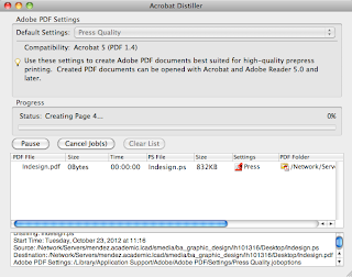
  •  Open Acrobat Distiller
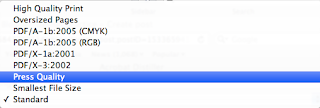
  •  Change settings to Press quality - commercial print

  • Drag document from finder in to the the box

  • Now a PDF file > saves where the postscript file was

Can print the CMYK separations of your document


WebRep
currentVote
noRating
noWeight