
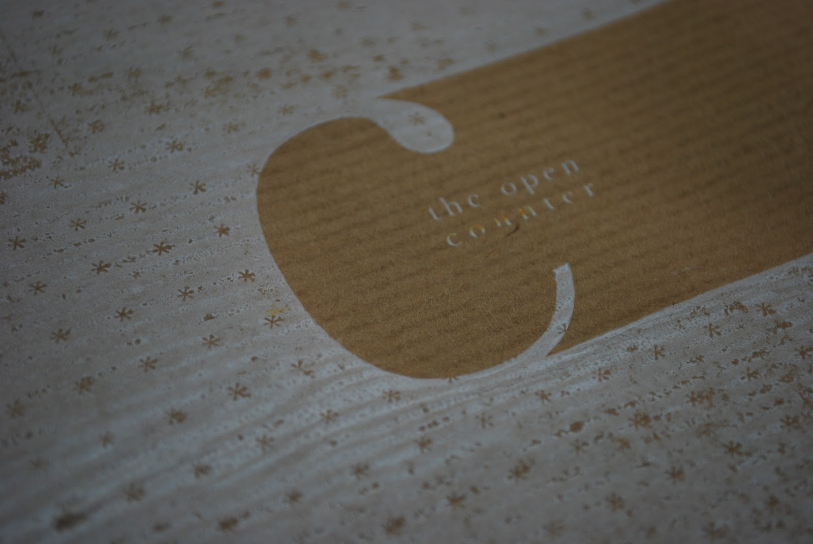
This is a digital mock up of the white on the brown stock.


To try and create a physical mock up was difficult because printers don't print white. The only way to do this was to screen print it. I went to screen print two designs, one with the pattern and white with the brown showing through and then the opposite with no pattern.
Unfortunately the screen didn't expose very well because of the person who clean it before however you can get a feel for how the design would look with white on brown stock.

These are some of the screen print attempts

The text came out quite clear when by itself however the ink smudged a bit with the solid fill around it making it harder to see.


You can see how it came out grainy because of the screen although it is quite effective.
I mocked up the nets up so you can see how the design would look finished. I felt the 'C' was to big to the surface area and it wasn't what I was expecting. I didn't like the feel of the ink either. Although I no it wouldn't be screen printed for real as it wouldn't be appropriate or ideal and you can get printers to print normal white ink, at least I could see what it would sort of look like with the ink on the texture and the overlay of colour.


I also mocked up a design with a window in the bag going on the crit feedback of the food creating the color. I really like the effect of this one, I feel it looks professional and still keeps the design as well as the concept.


These are the nets, full scale and plain. I'm going to add white sticker paper to them with the design so you get a good physical mock up of the white design on brown.
No comments:
Post a Comment