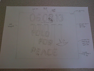
For my history of website I chose the fold for peace event I created for the promotional products as this topic interested me and I thought it would a much more viable website then one talking about the history of origami. I started off my listing possible things that could be featured on the website homepage. I then created a flow chart of the navigation pages on the homepage to get an idea of what content I wanted to include.
I then designed three different home pages displaying varies information;
My crit questions:
- Do you understand where to go to get the information you want to find out? (without seeing notepad)
- Do you understand what the websites for? Explain
- Is there anything missing?
- Should it have more information on the homepage or is it clear enough what the event is?
- Does it appeal to the right audience?
- Are there any improvements I could make?
Crit Feedback:
Lorraine
Strengths:
Clearly labelled buttons
Unorthodox layout, which still works due to standardised navigation
Areas for Improvement:
I would suggest some explanation text on the front page - videos aren't always watchable (library, in work, connection speed etc.)
I'd click away without any explanation
Simon
Strengths:
Really like how content fits in with the design/layout
Very strong visually
Areas for Improvement:
Consider introducing more text without taking away from the clean/clear/high impact design
Considerations:
Introduce instructions/text
Group 1
Strengths:
Using a video as homepage greeting would work well, adds more interest than scrolling through text
We second the strong visual point. The design is very engaging and interesting, hanging text is topical
Areas for Improvement:
There isn't really anything on the front page to explain exactly what is going on
Considerations:
The date is only clear on one scamp, should be centre on all we think
Annual peace day could be a logo and larger
It would make it more personal and professional (there is a logo but we think it needs text)
The ICAN logo is already a thing. Could you design your own?
We would like aspects from all scamps to be merged
- big date
- video
- hanging text
- logo
- explanation
Response:
I agree that the date could be more of focus on the scamp and that more could be done with annual peace day
When it comes to designing my own logo, the ICAN logo is there because its that charity who's event it is but I could of made that clear by including the text of the charity. I agree about different aspects of the 3 scamps being brought together into one functioning idea which is what I plan to do.
Group 2
Strengths:
The countdown makes it obvious, countdown to a day event
Video would explain about it further
Logo top left draws eyes in
The hanging paper type works well and draws audience in
The title s really self explanatory
Areas for Improvement:
Sans serif typeface friendly but need to be more clear the point size and exact style
Trident logo could be straight not angled, could be made simpler
A 'Get involved' page for donations would be useful as it is a charity
Considerations:
The date would look really good as a countdown
Share links place in eye catching place
Inclue a countdown on every page
Logo in the 8 looks too forced, logo one its own would work just as well and would still look clever
Response:
Again I think it would be good for the countdown to on the final design as it makes it clear that the website is for a particular event/day. I don't think a donations page would be suitable because it's not about raising money for the cause its more about protesting but 'get involved' is a good navigation tab to have possible instead of action as its more clear.
Crit questions feedback:
DO NOT
Validation
Loaded questions
Does it work?
What would you change?
Ask why your proposed either/or designs have been chosen in feedback
Write useful questions and be SPECIFIC to get the responses you want
New scamp designs:
I tried to combine all the different parts of the initial scamp designs together in order for the homepage to function well and give the correct information. This was difficult because I didn't want to compromise on the visual impact of the different areas but placing them with each other was easily confusing and lost the initial focus they had. I tried to avoid it looking busy and keep it simple using different elements of the the initial scamps and juggling bits around to make sure I included it all. I feel I am close to a design but that the workshops will enable me to have a better insight into what will work and won't on web.


No comments:
Post a Comment