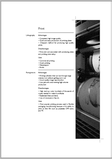
I've begun again.
I've wrote out my contents properly listing what page will have what information on it. From this I did a finalised layout design sheet so I could see what would sit next to what and how it would be lay out.
I've been struggling to find a font for body text that goes well with my heading typeface of Helvetica Neue Condensed Black without it looking cheap or amateurish. I've gone back to the heading to see what could improved as I think its to heavy in weight especially as its supposed to be based upon the Pantone typeface.
After consideration and trialling i've decided to stick with Helvetica Neue but use condensed bold instead and for my body text use Gills Sans.
From this decision i've amended my chapter and title pages and begun designing digitally.
After designing my colour page in digital based on my design sheets I felt it was way to busy, there was to much colour especially as I wanted to keep it as near to black and white as I could and it didn't fit in with the rest of the layout of my booklet. This led me to make some decisions in separating the different elements to create more white space and single out the colours.
All my text was originally left aligned because when I first started with columns they were to thin to justify to the text box. When I got to this page I justified the text box and when Lorraine was helping me she asked me why that page looked better than the others. I noticed this factor and then went over all my pages and justified the text to give a consistent and clean layout. It meant a lot of editing of text and tweaking of position to get it right but I think it defiantly made a big difference to my design and from this I started to feel better about it as before it wasn't achieving the visual I was hoping for.
When I originally lay out this page I had the colour bridge to match the pantone colour of the swatch. However, I noticed that when I realigned the body text it looked like the swatch was continuing on. This led me to change the bottom image to the darker end of spectrum so the idea of the swatch continuing followed across both sections.
With the stock page I had a lot more content then I had realised when designing. It was really hard to layout the text how I had planned as I wanted thin columns but the text ended up getting split up. I widened the text boxes and justified it with the last line aligned left, this meant I had to edit my content to get the text to read and work better visually. I started to notice a pattern and rearranged the different sections to create the curved line which added interest to the page.
I had copy and pasted my images from photoshop into indesign instead of placing them. This meant I had to go back and resize and edit my images to fit the correct size and resolution to print. This meant that in some circumstances I had to change the image from what I had originally planned on having.
This page in particular I had to really rework in terms of layout as the space I had allocated for text in my design drawing was unrealistic to the amount of content I had. Therefore I had to restructure it and spread it across 3 pages in order to give a clear communication of the information and stick within a similar layout design. I think it would out nicely in the end and became a lot more visual and clear.


No comments:
Post a Comment