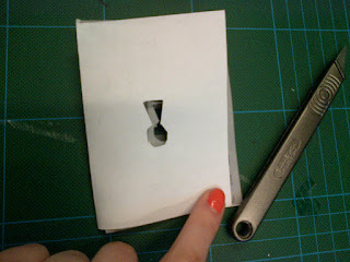
I printed and cut out the designs i made on illustrator to see how it looked and if it layered up properly
This made me realise some mistakes i had made in the layout such as the keyhole shape being upside down on the one side of the booklet. I also decided to change my design as i didn't feel it really connected the keyhole and button/stitching side to it.
laying out the buttons to get the same size circles
I realised not every page would have the stitching on the edge and therefore altered it as well as the colour of what the stitching will be
Also i realised the the colours weren't what i wanted for the booklet s they were to harsh and bright and the stock i planned to work on was more delicate than this. I started playing with opacity altering it from 100 to 50.
Again i wasn't to sure so started to look at combining different opacities to get different overlays
This i felt worked better and added the layers of the grid, stitching and cut out holes to see what it would look like.
The white space showing what no longer will be there
I realised the stitching again wasn't right and moved it around
then taking away sides that won't actually be stitched in the first two on the left
It all together again
this would be the reverse side with the red button as the front
a rough example of what the stitching will appear like using pattern swatches on illustrator
I now need to print this and see if it is all aligned and works in positioning and atheistically


No comments:
Post a Comment