
Tuesday, 31 January 2012
100 things.. New direction
From my current idea of educating people about costs involved in brands my focus has changed with branding and i've started to look at merging of brands for the good rather than how people pay more for them. I've looked into the brand Penguin books in particular and was very interested in there design and company history as they were revolutionary in spreading and encouraging reading. This made me think about how people don't tend to read that often these days and if they do it's off a piece of technology such as an ipad or kindle. This will soon destroy the industry of books and books are amazing things. Therefore i've decided for this brief i'm going to use my knowledge of branding from my research to do a campaign to encourage reading combining famous company Penguin, who initiated it originally, and well known brands who could help using there products and service such as coffee houses, bookstores and food chains as these are places people could read.
Monday, 30 January 2012
100 things.. exploration
I explored adding to my logo dissection posters to communicate more about the cost of branding and make them more visually interesting.

i first added a pound sign as a way of instigating that its the cost that adds up

the pattern i formed using the logo for a swatch

multiplying the pattern into the background

changing the opacity to make it more subliminal and delicate


i thought the test needed jazzing up bait as it was boring so i lengthened the I and put in a plus sign complicating the statement and also drawing the eye down to read the text

i thinned it out drawing more attention and making it more visual

poster as a whole

i experimented adding the pattern as a whole background

i think this works well and makes the pound line even more subliminal and less noticeable

i increased the opacity slightly as it got lost in the background

seeing what it looks like without the pound sign

poster as just the background and pound sign as a visual

adding in the text to see if that communicates better

layering the directed logo made the pattern also playing more with the use of opacity

making it more gently blended and removing the fill of the text

played around with just using the text and enlarging it as the main visual aspect

when i looked at the pound sign more i saw that i could add the plus sign within the actual shape of the pound sign and that this could work well to show that the costs add up

i made this image into a pattern to experiment using it as a background

making it a smaller pattern

over laying the logo to make it appear as if the logo it made out of the pattern of pound signs

changing opacity to make the pattern appear more obvious

using a smaller pattern

altering opacity sticking more true top the colours of pepsi


having solid colours making the pattern more subtle

using the pattern in the disection of the logo

using it as a background against the dissection of logo

blending the logo and pattern

making the logo out of the pattern

defining the logo with a stroke
i didn't think this worked very well so discarded it

i added the large scale pound symbol in with the pepsi logo and defined and the cross as i didn't think it was very clear in the pattern

i changed the colour of the cross in the pattern to the background so it wasn't so harsh

i then tried combining both together
I don't feel these ideas are communicating very well and are getting to busy, to much and still not communicating what i want. I need it to be clear, simple and effective and this is not developing into that.
i thought about dissecting it differently, stemming each part away, visually i think this looks good and clear

i'm struggling to make this idea communicate through my designs clearly and simply though and can't see what I can do to fix this
Hotdog Booklet: FINAL
After reprinting on to my 10 prints i drew out a rough sketch of the stitching on one i test printed for alignment.
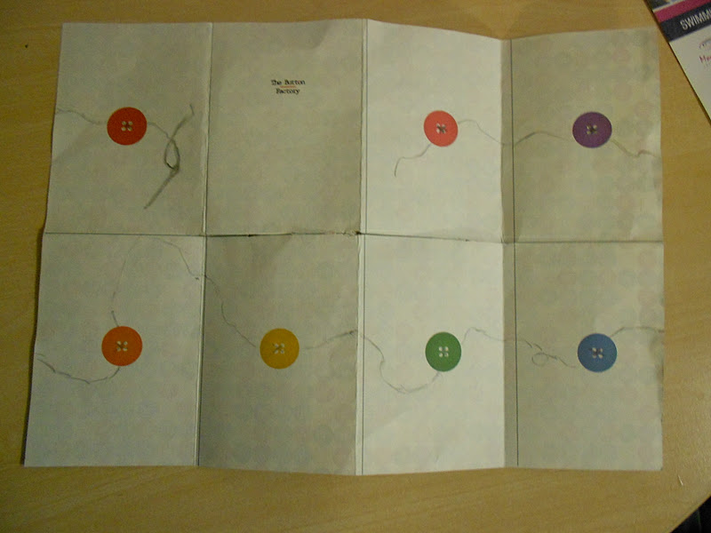
how the stitching will fold per page:


final stitched booklets in different colours:


Subscribe to:
Comments (Atom)