I skills i have developed in this module i feel are managing briefs from all parts of the course at the same time. This will be important to cope with next year and at first i did struggle to prioritise the briefs for the different modules as they ran at the same time and i still feel i could approve on this skill further but i still think its a skill i have developed even more with this module. Another skill i have developed has been to produce a range of items that work as a set or series. With the stamp brief i had a range of formats from the actual stamps to the cover to the presentation boards which i felt all where clearly as a set as they were printed on the same paper, designed in the same way using the same imagery and type and had a flow throughout the work. This was also shown through communication is a virus with different formats, poster,leaflets and business cards which were clearly a set through the layout, colour scheme and content. It's your choice and Eric Kessels brief also had a consistency within them whether that be a theme or constancy in design. I feel i have defiantly applied this skill to all the aspects to this module as i can see through my work that they are visible a set.
What approaches to methods of design production have you developed and how have they informed your design development process?
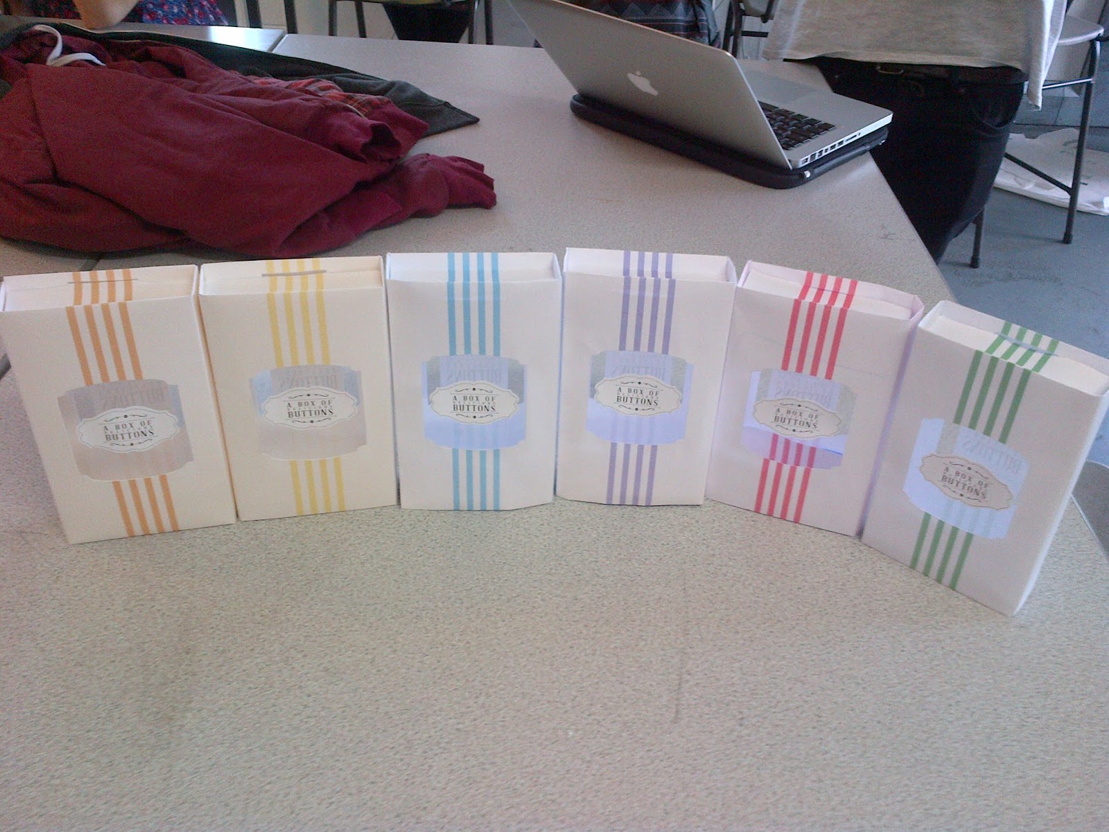
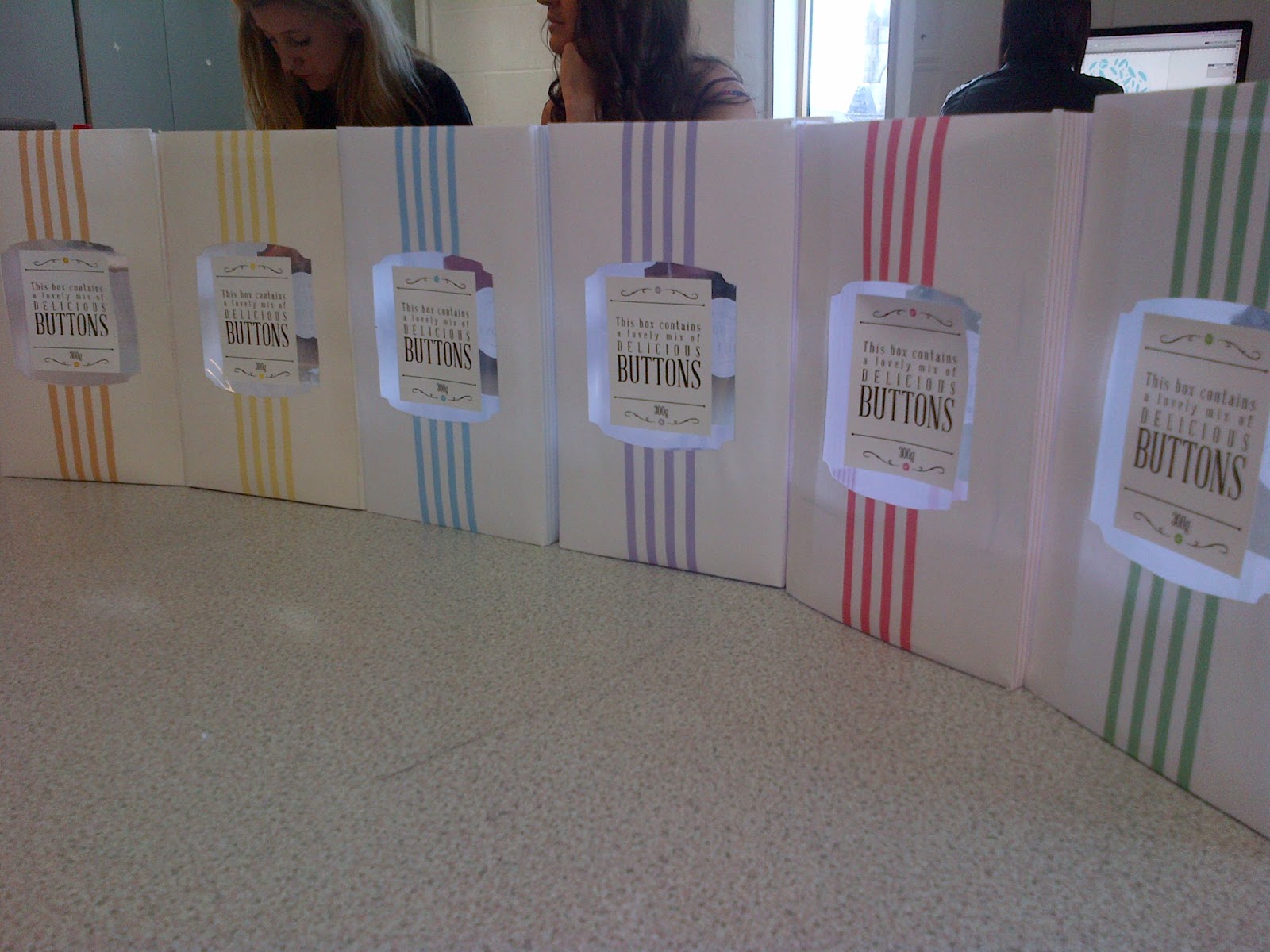
I've been more practical in my production in this module by building packaging for Its You Choice, i think i chose a different route to take in what i could continue on and attempted a different approach to the brief by choosing packaging as it wasn't the same format i had began with. It had informed my design development process by developing my design to fit the different formats and changed a lot of the normal routine and timing of a brief. This brief took an extended amount of time as there was a lot of working out and making involved. This has informed me that in the future when doing a different method of production that printing i need to insure i have more time to really put work into what i'll be doing.\
What strengths can you identify in your work and how have/will you capitalise on these?
A strength i have identified is going back to researching whilst working on an idea instead of it just being at the beginning. During the It's Your Choice brief i frequently went back to my research to get ideas, look at the visuals that i wanted to create, the weighting and grouping of buttons etc. I feel this made my work more productive and worked more smoothly as i didn't forget what i had found out and sourced new things which aided my design. Another strength i can identify in my work is that my skills on illustrator are being more efficient and perfected. I have found new techniques for perfected paths and using clipping masks and compound paths from other briefs. Overall this has effected my time in designing for the better but also the visual quality of my designs throughout all on going modules. A strength i think i can really identify in this module was from the communication is a virus brief where i was able to notice there being to many visuals and ideas all trying to be put in to one thing and it didn't work. This made us stop, re think and cut out what wasn't needed to and by reducing our ideas and designs generated a much more pleasing and communicative result. I plan on capitalising on these new found strengths by deepening my usability in illustrator, reducing more so in my work so there is only the information necessary. I defiantly felt i was more outspoken this time on the group brief and communicated my ideas across.
What weaknesses can you identify in your and work and how will you address these in the future?
One definite weakness in this module was time management in printing and finals. With all the deadlines coming up at once i was unprepared for the demand to print and i wasn't organised to think of this before hand so i struggled to get everything finished in suitable timing. Although my work was ready the ability to print i found hard and therefore printing and making in time was made more difficult. In the future i will defiantly pre book print slots at this time of year in order to achieve my work in its best quality and timing. For the Eric Kessel brief i found a weakness, although i had tried to approach a different angle on the rain posters this failed to comply with what the actual purpose was for. I mixed up the brief of in studio and the live brief being the same thing and found my idea being more appropriate towards the idea the brief was giving of promoting rain and britain as attractive but not with the intention to be showcased at a design talk. In the future i will consider all aspects of context and
audience before moving forward with an idea.
Identify 5 things that you will do differently next time and what do you expect to gain from these?
I will book print slots way ahead of the deadlines and organise for my work to be finished by that point. By doing this i will have my work completed on time and without stress.
I will consider the timing to undertake a task i have given myself and the necessary focus and organisation i will need to prepare in order to successfully accomplish it. This will relief me of added pressure and a more easy and enjoyable process.
I will focus on what the brief is asking for, do more research into what it's asking and deliver the right message without going to astray. This will let me answer the brief efficiently and aid my process in completely a brief successfully.
I will try more practical approaches to design and gain skills in other areas of graphic design.
I will consider the interaction of the design and the audience and how this can be pushed beyond boundaries. Hopefully this will increase my creativity and imagination to create different kind of designs than 2D print.
Attendance - 4
Punctuality - 4
Motivation - 3
Commitment - 3
Quantity or work produced - 4
Quality of work produced - 3
Contribution to the group - 4