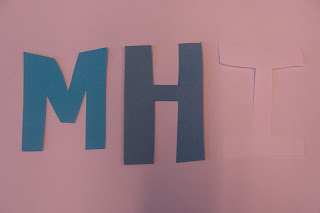
Today we used faint and bright shades of paper and chopped them up into random geometric shapes. We then tested the effect different backgrounds had on them such as different greys from furniture and bright white, off white and black paper. We could see the change the background had on the geometric colours of card and how certain backgrounds brought the colours out more and some fade.
Hierarchy of colour on backgrounds


No comments:
Post a Comment