For the opening night of the exhibition photographers will be invited to take photos of the party using the cameras provided in the exhibition. These will be the first lot of photos displayed at the beginning of the exhibition.
Each day is a different analog camera
The gallery would provide a selection of analog cameras to customers of the exhibition and they will freely use the camera to take photos around the space which would hold other analog items such as old toys, sofas, books etc. These then will be processed and printed overnight and displayed the next day for the second day of the exhibition.
This then will become a circle in which all the photos of one day will become the photos for the next. At the end of the week all the photos will be displayed together to show how much fun people have had using analog cameras and the photos will be up for sale. The users of the event will get a complimentary photo with there initial admission so they can keep there favourite photo from taking part and the others will be for sale for a small amount to show how valuable and popular the results of analog photography can be to them and others.
All the pictures will be stored online in a gallery with the results of the exhibition filed by day and then be available to order for print. This gives the social networking sites a chance to promote the results of each day where people can share what they took with what they took it with to enforce the fact it was produced by analog cameras.
In order to combine the two visual concepts to the exhibition where the audience is interactive I used the element of 'Snap!' as a flash on the front of the camera next to the lens. To make this a more playful and exciting tone, as mentioned in the crit, I decided to use a neon pink which is eye catching and colourful making the atheistic less dull and concentrates on the element of a flash which is a sudden bright motion.
I showed how this could be applied across a range of different formats focusing on the topic of promotion and packaging provided in the brief with a tie to branding and identity eg. of the exhibition. The logo would be screen printed to represent a bright spot colour. I considered using a metallic foil but felt that with the choice of colour this would appear quite tacky and matt would be much more attractive to the audience.
I still want to use dimensions of photo for formats to incorporate the good of an actual product of a photograph in the design.
I also did some primary research in Urban Outfitters as I found they had analog cameras and accessories in there stores in my secondary research. Here is a few examples of the type of things connected to analog that sell in store. These could be things sold at the exhibition shop and on the website.
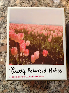
I also went to saltaire mill bookshop and found loads of interesting books on photography. Books on analog photography and cameras could be sold at the exhibition and also online as well as things such as the 'Pretty Polaroid Notes' and stationary.
With the shop element and idea of online promotion in the concept of the exhibition I saw the potential for the website. I started sketching ideas of how different elements would work and look as well how different camera actions could work across different functions to bring the analog and digital together.


No comments:
Post a Comment