
After realising i hadn't scaled my template down from the original grid i decided to do my final idea in the correct thumbnail size combining two ideas i had generated in other design sheets.

I then did a full size grid layout also as an aid when creating digitally

Grid Layout

I added extra guidelines so that my text was within the 2/4 and 3/4 of the page

Placing in text and image
I decided to add something a bit extra as there was a lot of white space

text up close

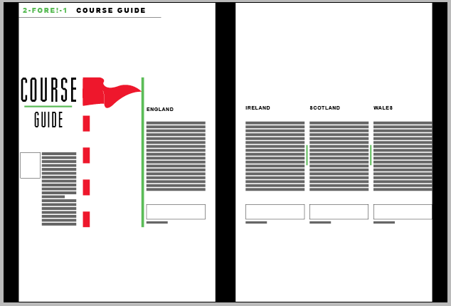
I didn't feel the proportions of the flag was right so i descaled it to the introduction height, this made a perspective of distance between the golf ball and the flag.

This made the title seem out of place so i played around moving that

I played with colours of the bars in-between the text and how the title could be displayed incorporating the circle theme of a golf ball more

I made the bars decrease between the text to create a flow of hierarchy between the paragraphs of text and tried different colours.

I liked that the flag was the only read on the spread so i decided to make the lines black and a dashed line instead.
I decided to change the text up and add drop shadows and bevelling to give depth to the spread.

I incorporated the article name in between title
Playing with colours:


changing shadow

Wrapping the introduction text around the image


I decided to add in the quote and change the title into an oval rather than a circle in connection with a golf club shape as the circle as i didn't feel the circle was fitting well on the spread.


Final result!

No comments:
Post a Comment