Monday 30 April 2012

Its Your Choice - Plan

After looking over the tasks and briefs we have had throughout the first year i have decided to focus on my hotdog booklet. I've decided to work on my hotdog booklet because i feel i enjoyed doing a different process than just printing but also because i feel that it could be pushed from a hotdog booklet into something more like a professional publication or maybe try a different product or process using buttons.


I researched and explored into different areas that i could go into for content as there wasn't much to the hotdog booklet:
The history of the button
Craft making with buttons
How to stitch a button
A product brochure for a company called 'The Button Company'
Types of buttons
Poems


None of these particularly inspired me so i thought of doing something practical with the buttons.
I picked this brief because i'm interested in buttons, visually with the shape, size, colour, variety. I also thought of possibly experimenting with stitch and researched into typography which is another thing i'm interested in visually. 
This is something that i want to explore. I liked this idea:

I struggled in the crit with the small group because i wasn't entirely sure what i wanted to do still but they were helpful and offered ideas. Eventually i remembered a previous idea i'd had when i had been working and researching it the previous week, of creating packaging for the buttons using sweet packaging as a basis. Therefore from this point forward i am going to be experimenting with packaging and nets to contain buttons.

Monday 23 April 2012

Design Principles: What is a line? - Final Outcome

For this brief I designed an aztec pattern out of glasses as my three words were glasses, aztec and layout. I  decided to extend this into a range of prescription glasses for young people to try and encourage them to wear there glasses more and make glasses appear stylish and fashionable rather than 'nerdy' which they often stereotypically can be seen as. I created a prototype pair with one of the patterns I made and a matching glasses case. To market this range I made it specific to Specsavers, a company selling prescription glasses rather than just fashionable, and produced a series of promotional posters, appointment cards and prescription guide. For my promotional posters I specifically focused of communicating that they were prescription by incorporating issues of sight such as blurriness, short and long sighted and double vision and the aspect of them being stylish by using famous personas known for wearing glasses that appeal to the young market such as lady gaga and harry potter.


Final Prints:


Design Principles: Self-Evaluation


Overall from this module i feel that i have developed a lot skills into the theoretical side of designing. Learning about the effects of type and how you can alter certain elements through such things as kerning and tracking etc has altered my designing as i can produce what i want  effectively and professionally. I feel similarly about learning about colour and the principles of combining colours and how this can alter how it not only appears but the communication. This has been something that i have had to consider when designing and printing as it can really effect what my design is communicating. For example when choosing colours for my What is a line? aztec pattern i needed to consider my audience and context before picking a palette and when designing the promotional posters how the colour patterns effected one another and its legibility. 
I found learning about grid and layout particularly useful as previously when designing i had no structure whereas now i am more inclined to use a grid to layout my work to create a professional and fluent layout throughout my work. This has not only helped the atheistic quality  but also aided the design process as from working with design sheets to producing the design has become more accurate,focused and neater. This is a strength i hope to develop further as i no there is still a lot to improve on and will be very beneficial to my designs and work method.
A strength i have noticed in this module is problem solving as when doing the hotdog booklet brief it took a lot of prototypes, practices and tests in order to get the design right and laying out correctly. Although i couldn't do the original idea i was able to twist the design in a different direction and still be successful as i sold five books at the book fair!
One weakness i have found in this module is design sheets, i feel i have been designing more digitally rather than sketching out enough ideas first, particularly with What is a line?. In the future i will push myself to draw out and write down ideas before i jump into designing digitally. Another weakness i struggled with in design principles was getting my head round the seven contrasts of colour and the differences between the two. I understood the presentation to a point but when it came to applying that myself i feel i struggled.
If i was able to go back and change something in this module i think it would be to be more practical and hands on with my work. I feel a lot of my work is becoming digital and print and i'm loosing the skill to create something with my hands. I enjoyed doing the hotdog booklet and was really excited about the brief but i feel i could of pushed it further and done a lot more with it as the brief was so open.
With What is a line? i would change the way i created my designs, i feel that the way i used illustrator to create the images and patterns was very amateur and this made my life very difficult when trying to make the pattern continuous. I feel there is a lot left to learn on illustrator even in the basic tools.


5= excellent, 4 = very good, 3 = good, 2 = average, 1 = poor


Attendance - 4

Punctuality - 4

Motivation - 3

Commitment - 3

Quantity of work produced - 3

Quality of work produced - 2

Contribution to the group - 3

Sunday 22 April 2012

Design Principles: Zombie Type

Manipulating two fonts digitally

Block overlaying


Overlaying creating space


Joining parts


It was more difficult than i thought to combine font types together but with there being so many out there theres so much potential to create crazy typefaces and made me think about designing in the future how i could transform a title into something new and different.


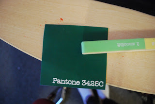
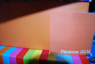
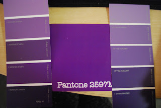
Design Principles: Pantone


CONTRAST OF TONE
Formed by the juxtaposition of light and dark values. This could be monochromatic


CONTRAST OF HUE
Formed by the juxtaposing of different hues. The greater the distance between hues on a colour wheel, the greater the contrast.


CONTRAST OF SA TURA TION
Formed by the juxtaposition of light and dark values and their relative saturations


CONTRAST OF EXSTENSION
Formed by assigning proportional field sizes in relation to the visual weight of a colour. Also known as the contrast of proportion.


CONTRAST OF TEMPERA TURE
formed by juxtaposing hues that can be considered ‘warm’ or ‘cool’. Also known as the contrast of warm and cool


COMPLEMENTARY CONTRAST
formed by juxtaposing complementary colours from a colour wheel or perceptual opposites