Monday 24 October 2011

Proverbially Yours// Message and Interpretation

I googled the key words as well of the proverb to get some understanding of the quote

brief considerations
range of ideas for text, image, text and image to do with the probverb

i took a few of those ideas and developed them into a set or series of 3 posters one being text, another image, the third image and text

Changing the arrangement of the 3 posters


Thursday 20 October 2011

Alphabet Soup: Workshop Illustrator

As part of my visual investigation i attempted to make all of my 10 letter 'm's representing pop in Illustrator. Some where more easy then others using the simple text tool or the pen tool whereas others where more complex to form.

I created a pattern of dots and made a swatch to fill this letter, i liked using a fill that i'd created and think it came out well.

This one was more simple i just used the text tool to create and upper and lower case of the letter, filling one white and one black, bringing the lower case in front of the upper and overlapping.

Although initially this one started off well simply creating a perfect circle from the eclipse tool i struggled in getting the defining lines inside right using the pen tool. I'd made two separate lines on the bottom half and it wouldn't let me delete the one overlapping the one i wanted to keep, after expanding and using pathfinder i managed to get rid of it. I like the idea of this one and i think it represents 'pop' well.

This one was again not so difficult and after creating lines with the pen tool i again expanded, used the pathfinder and delete the unwanted lines.

I like this letter, i think it has a slight humour to it. I created it the same as before, adding a jagged line with the pen tool, separating them, rotating the part above and adding lines indicating movement to show how its 'popped' off.

Using the same technique i cut the bottom two serifs off and rotated them slightly.

I like how all the letters look a lot more clear, neat and crisp compared to hand rendered. 

Using the pen tool i curved the top of the 'm' and bottom to form similar shapes to music notes. 

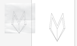
This one was the simple pen tool adding a 3D pop out effect.

I used 3 separate letters filling two in with white and one black, bringing one to the front and another to the back to create a layered effect.


After visually investigating all my letters i decided i wanted to make a pattern and create a swatch to fill my 'pop' alphabet with.


I started making a pattern out circles using a variety of different sizes and after looking through the brief decided to take the opportunity to use a colour within the pattern. I changed some outlines to a deep pink and filled a few some ones with it. I liked how this changed the pattern. I then saved the pattern and made a swatch from it and used it to fill text. However this didn't seem to go as well as planned and the letters weren't clear enough as some of the circles where to big. I began editing my pattern repeatedly by shrinking circles and adding more in but struggled to get the right consistency of circles that i aimed for because it wasn't detailed enough. This lead me to form a big block of the pattern by selecting a section and using the repeat technique to form a big block as before it wasn't in a square or rectangle and was forming white space around the swatch. 

However this lead to the letters being cut off on different areas of the page as you can see with the 'P' and glyphs. As you can see i tried to separate the alphabet into sections instead of in one text to see if that would help and still no luck. With the help of Simon and aid of Adobe Help we discovered the swatch still had white space around it and that was what was causing them to be cut off. To fix this I added a borderless empty rectangle into the pattern and then made another new swatch. This then made solid swatch with no white space, finally!The letters where then full form!

Through visual investigation i played around with opacity and liked how it changed the pattern. This lead me to cut the alphabet up in sections on how it generally is said and decreasing the opacity level by level. Similarly to how its said (loud at first then slowly less enthusiastic) the sections fade from the intial bright pattern. I think this is a good representation of pop as not only is it using the pop art pattern of circles but just the like the action, the opacity is initially loud and active and begins to slowly fade.

Printed A1

Illustrator Introduction

We had an illustrator introduction where we learnt some basic skills to aid us in our digital work. These are some screen shots of what we played around with, although initially very bad the skills i've learnt have already come in handy massively and i am loving creating things on this software.
Editing Type
Variable Width

Gradient Attempt
Gradient example
Pen Tool

Repeat

Pen Tool Exercise

Pathfinder


Blend

Tuesday 18 October 2011

Alphabet soup: Typeface in practice

Andrea Cooper
Progress crit:
Andrea said she could see that the letters were conjoined with the following of the alphabet and that she thought that might be connected with the side of her personality being danish and english. I was glad that she liked it and that she understood part of what i was trying to communicate in her typeface. 
It was said that the idea was good and that there was defiantly something there to work more on. It was suggested that i could possibly rework a few of the letters more and develop them such as the 'T' to ensure legibility.

Friday 14 October 2011

Alphabet Soup: Typeface

Name Badge


When printing the name badge i decided to print out a few variations to see how they look visually once printed. I decided to go with the last name as well slightly bigger as when i asked peoples opinions they favoured that one.
Original
Final

Wednesday 12 October 2011

Alphabet Soup - Typeface Development

I printed out my sketches a couple of times to experiment with different widths and styles to the designs i had created to try and get more of Andreas personality and character across in the typeface. First i made the main body of the letters thick and then the parts representing the following letter thin to create a contrast between the two sections as to bring to light what was happening in the typeface and show the duel aspects of her personality in a more obvious approach.
 

I then switched the inital idea and tried making the main body of the letter thin and the parts representing the next letter thicker to give an opposite effect. I quite liked how these where looking although for some letters it did become difficult.


For my third attempt i tried making the letters more curvy instead of so straight and serious, this showing the open minded side of her personality as well as her friendly confidence when meeting new people. This however didn't look as effected in comparison to the others.
 

I asked my year tutor about the three different styles as i wasn't sure if they were liable as letters or a typeface but she spoke postively about them and agreed they matched what aspects i was going for. This lead me to trace the second idea on illustrator to get a more clean and accurate base for my final A1 sheet as well as get a clearer idea of how i'd work as a typeface.
This gave me these:


I then thought about putting them together on one sheet to see how they'd look collectively on a 4 x 8 grid as the brief instructed. When doing this i decided to add curver corner edges, taking away the sides of the rectangle subtly showing a cross shape across the page, this representing her danish and english side (the flag).
Finally to give me a further idea of how well it work as a typeface i decided to test it out as the name badge.
Overall i think it is ledigble as a typeface as its still clear to read.

I plan on filling the thick sections in when handrendered to presented her confidence as the thin side will display her lack of self esteem.

Design Principles: Visual Literacy

Galiant.

I named my font 'Galiant' as i thought it was very suitable for this letter.

Galiant Script Regular

Galiant

 Galiant is a mixture of two words; Valiant (Possessing Courage and Determination), and Gallant (Grand, Fine). This is what you call someone who excels at anything they play, mainly videogames. This word can be used to describe someone, or used as a proper noun.

http://www.urbandictionary.com/define.php?term=galiant


I then edited them on illustrator to make the varitions of the type face: shearing for italic at an angle of 10 degrees, increasing the pt for bold, bold italic and ultrabold condensed as well as scaling the condensed by 80% vertically. Furthermore i traced each one to make a handrendered finish ready for my next design practice tutorial.

Clockwise from left: Light, light italic,bold, bold italic, ultrabold condensed and regular italic.


Other named letters:
DragonsCave

Peculiar Locks

Tudor Establishment

Ivory Driplots

Friday 7 October 2011

Alphabet Soup: Typeface

 We got given a brief to create a typeface based on a personality/character of a partner picked from random in our Graphic Design group. My partner was Andrea Cooper so I then questioned her to find aspects of her personality which would aid me in creating a suitable typeface.


The results: 

Aspects that i thought were interesting and thought i might consider as a focus were how she acted as a rock for her family as they'd been through a lot and she appeared as a very strong person. She seemed to have a lot of cultural experience as she'd moved a lot and in particular Denmark, where she very proudly had adopted the language. Being Danish seems to be a big part of who she is and therefore i could use this aspect of her personality within the typeface. I also found it interesting as the Danish language is very different and hard compared to the english language.
5 Keywords and 5 tag words
5 A's on 'big' and 'feeling' 5 B's 'open' and 'power'


First i started playing around with the extra danish letters in the alphabet and the theme of being the rock of the family as well as the fact that she is open-minded. However i didn't feel much success or enthusiasm whilst attempting these. The rock affect wasn't coming through enough to be clear that it was  that texture and line that was meant to be representing that aspect of her personality, it just looked like a jagged line or weird blocks. This lead me to stress as to how to approach this brief. I decided to clear my head and write out what different ideas i could form from her personality/character.


I had a different range of ideas from this but nothing seemed strong enough or connected enough in representation. I was cramming my head with different ones, trying to combine all in one and it wasn't working so i started to look at the points separately. 


When i looked at misunderstood in connection with cultural i thought how could i make letters look misunderstood? This lead me to try combine a letter with the following such as A and B, then B and C and so on.


After drafting each letter, playing around with different options to combine them i ended up with these:


Although in early stages i quite like how its going.
In my progress crit it was suggested that i could play around with combining all different letters, not following the alphabet order, as well as incorporate more aspects of her personality i spoke about in it as although the idea of combining the letters together was a good idea, it needed to be more clear as to what it was representing. 
After that was when i tweaked them to look better and added serifs to represent how she is the stable factor within her family. The combination of the letters are meant to represent the combination of her two languages (Danish and English, which ironically have the same flag in opposition of colours, these being a factor of her culture as Denmark was the first place with a flag), as well as her experience of different places. Her name also meaning manly even though its a female name adds another duel prospect of her personality which could be said is shown in the duel combination of the letters. 
As you can see the extra letters in the Danish alphabet also share similar qualities as my initial idea which i thought was important as being Danish is such a big part of her and her character.


I want to play around with the thickness and fill of the letters i have created as so far i was just getting a shape in place as to how they will combine, now i want to shape them into more of her personality.