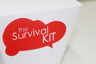
We edited the logo further by changing the font to Heiti Tc, playing around with the compostition of the text within the bubble and removing the outer bubbles. We then looked at various colours for the logo seeing which would fit best with the
concept of survival.
This is the initial add in for the box of a list of ideas for the contents in which the user might decide on. We havn't decided wether this be on the outside of the box or a leaflet inside.

We played around with various box templates and made 3D mockups to see what type of box shape would be best for our project. After seeing the templates in full form we decided we quite liked the idea of using the takeaway style shape and transform our idea more towards that theme for example provide a 'menu' of ideas what to list inside:
SIDES QTY
101 PLASTERS; for all those papercut emergencys |_|
MAINS QTY
201 HIGHLIGHTERS; for when that pink one just won't go on |_|
DESSERTS QTY
301 SWEETS; that desperate need for energy |_|
Possibly add a few sketches or pictures for a few like how menus will have sample pictures of food.
We were fond of the takeaway idea due it being quite a student esque thing and as well as the box being a nice shape it also matched our idea of taking the template home and building it together yourself.
We added the logo to a card prototype to get an idea of what the product would look like:
We then had the progress crit with another group from our course and asked them 5 questions after presenting our idea to them. This was a very vaulable and responsive way of getting some feedback on our idea, particulary as they are the audience we are aiming for.
It was agreed that we had picked the best box shape and that the product did help solve the problem. During the progress crit we discussed colour scheme for the box and logo which proved very productive and resulted in us changing to a brown card as it added texture and had more appeal then white. To match the new material of the box we edited our logo to red which for one looks better printed on card and two represents our concept of survival alot more than the calm blue pallette.
After the productive hour we decided to change the logo and put it on a prototype to see how it compares, already we can see an improvement, however i feel that a deeper, less bright red is more suited as the bright red seems to be a bit to much, almost harsh.
As we progressed we started to change what we had already started for example the add in sheet to the deeper cranberry red:
We finally made up a prototype in the card with the red logo and as you can see is much more effective, appealing and fitting for the title.
We then went about making the product as it would be sold, effectively a template on a piece of card which you would simply pop out and follow the instructions to create the final product, pictured on the sheet.
Overall i think it's ok but feel we could of done alot more and to a better quality (for example my illustrations are pathetic attempts) if we'd got our heads round our title faster and had more time to research and develop our ideas.


